Ennead Architects
Dynamic Planning
Dynamic Planning is a proof of concept for a SaaS planning platform that allows for data-driven decisions based on live building occupancy. In its current state, it is a data visualization dashboard that connects sensor data and institutional datasets to a building information model (BIM) in order to track an organization's planning goals.
Existing planning practices are outdated in their methods of data gathering. While smart buildings promise increased access to utilization metrics, there’s still a glaring human deficit in the nature of this data.
Most planning practices currently implement a waterfall planning arc where a project is completed in linear, distinct stages and changes in the original plan are difficult to accommodate. For this approach to be successful, a team needs to have a vast amount of data about the project from the start, which is often not the case.
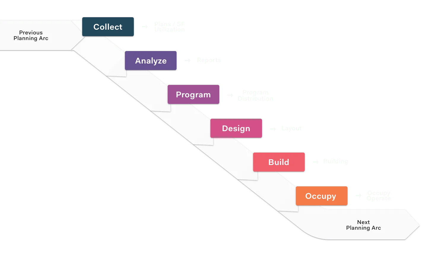
The industry is trying to move to a more agile approach, where planning decisions are done in a cyclical manner and each stage builds on top of each other. These decisions are driven by insights gained from different stages of the process happening concurrently.
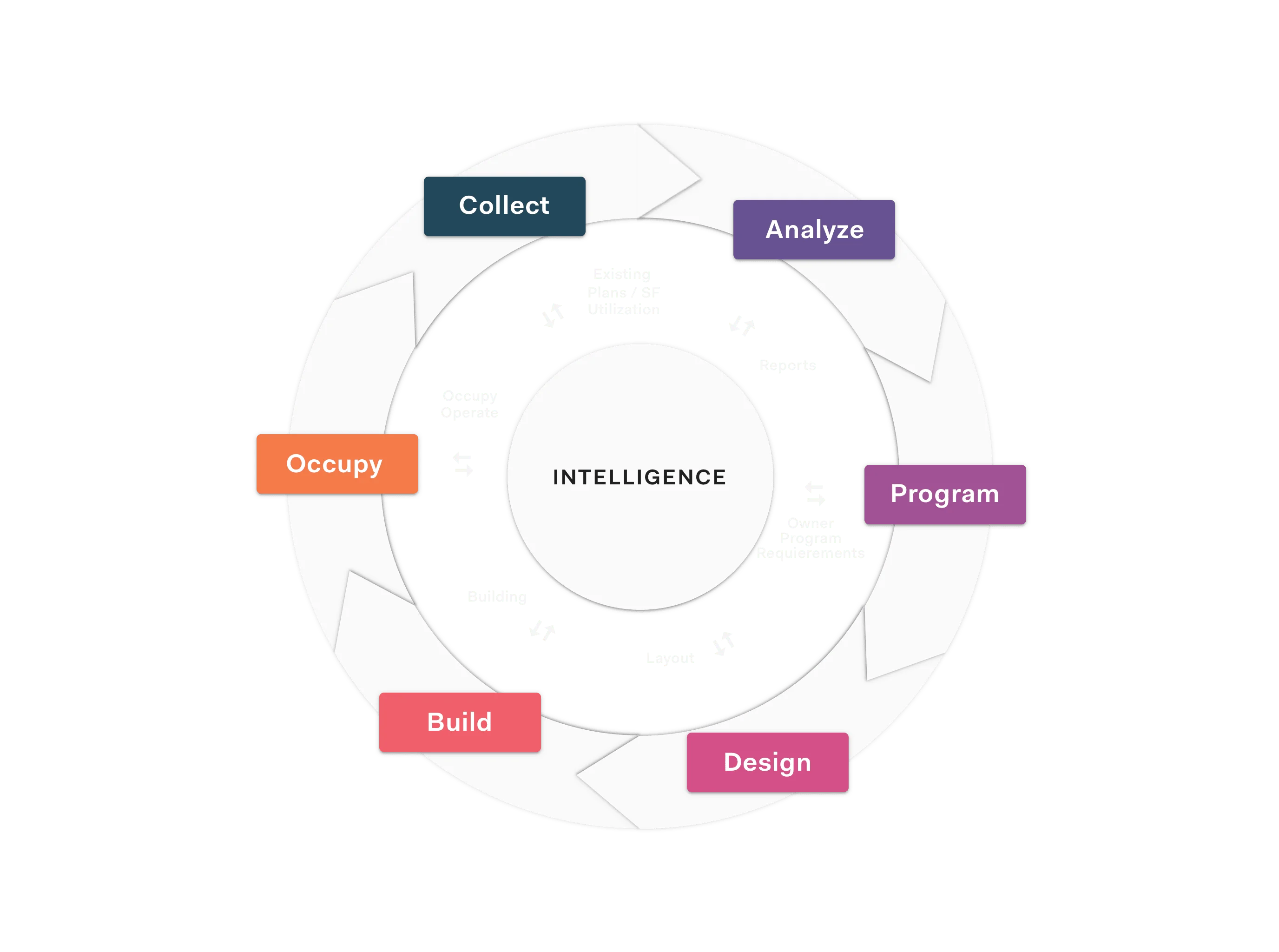
Planners need access to a reliable stream of metrics on building utilization paired with static organizational data in order to gain insight into human-centered space performance.
Dynamic Planning does not aim to replace the role of a designer or planner. Rather, it aims to provide more agility and intelligence to their work by proposing a new framework for planning. For the user to obtain these insights, we decided to implement a visualization dashboard with search functionality as the principal mode of interaction.
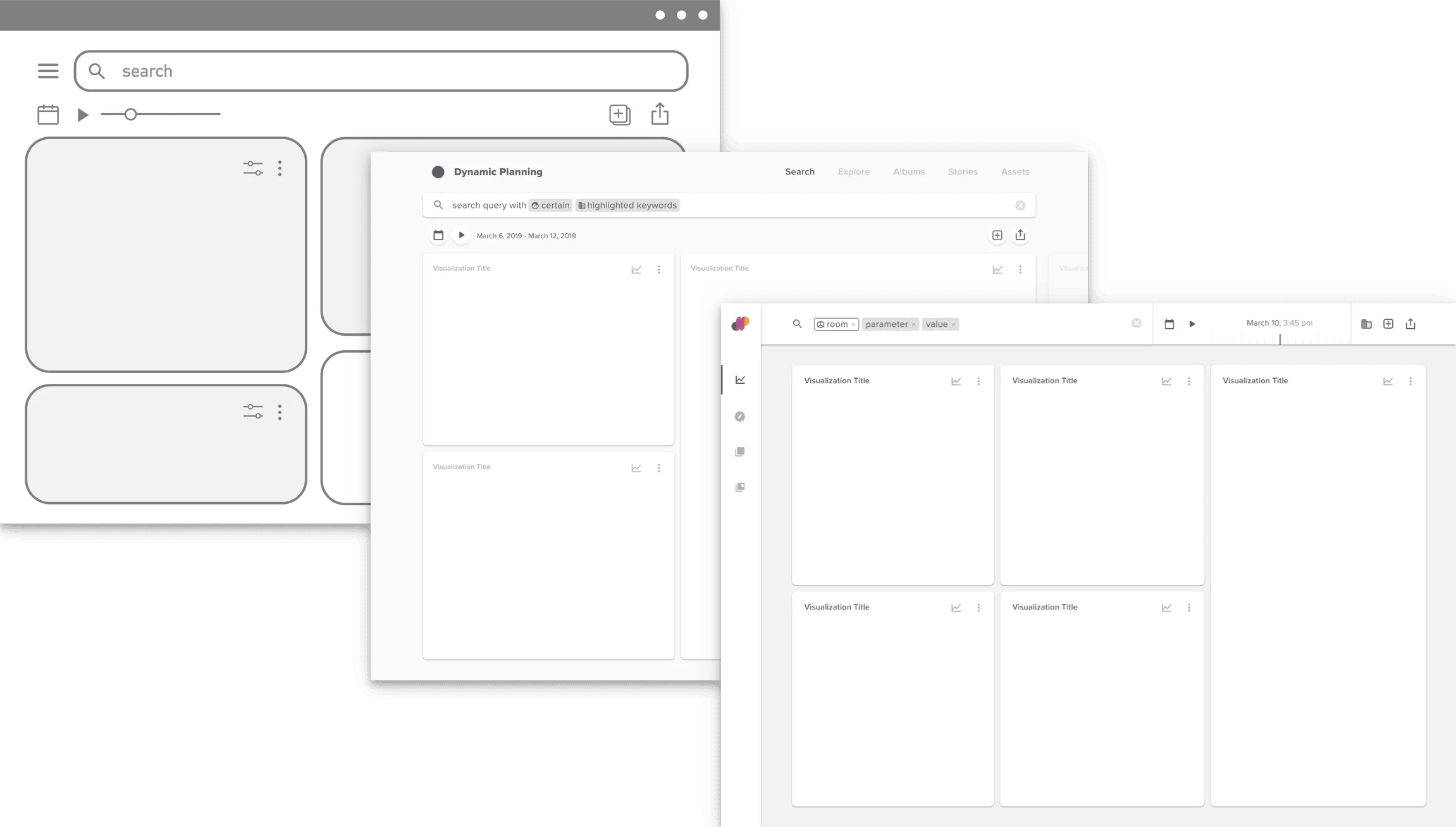
Low, Mid, and Hi-Fi Dashboard Prototypes
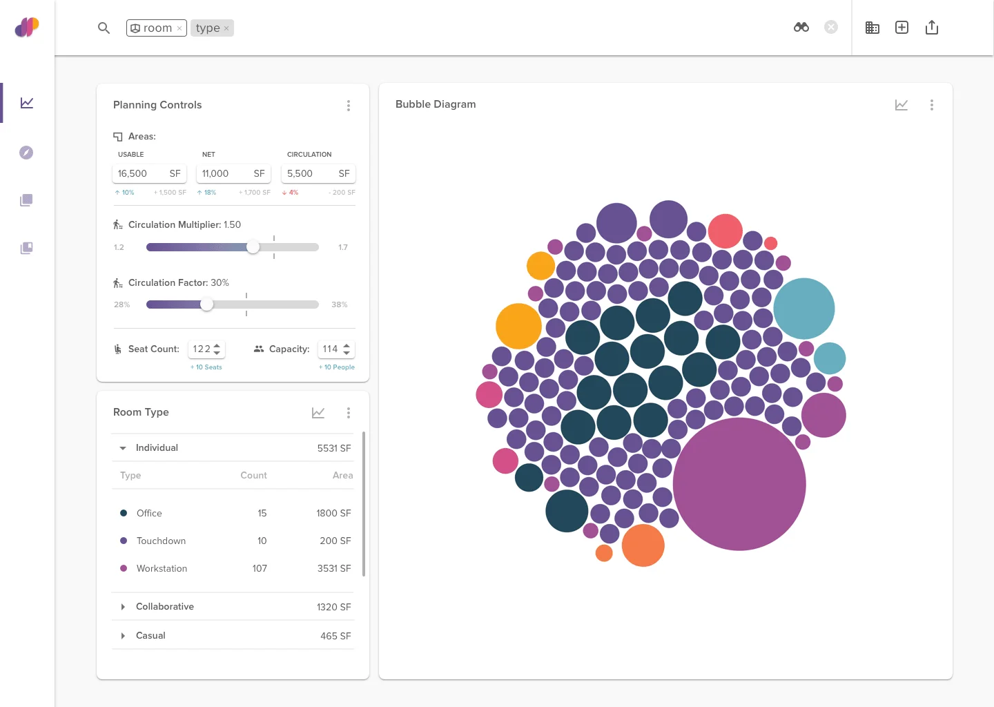
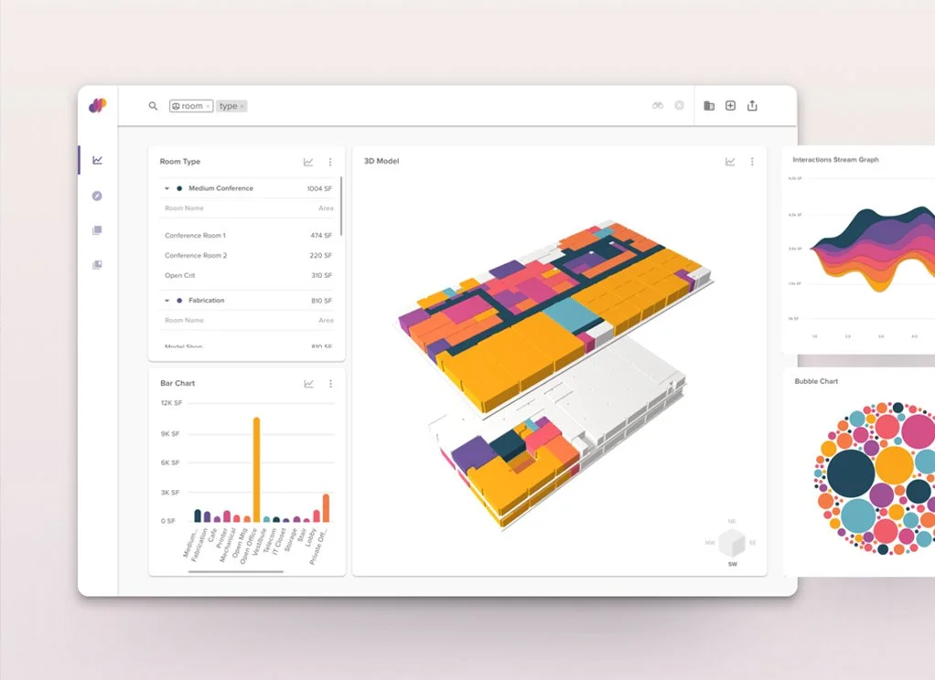
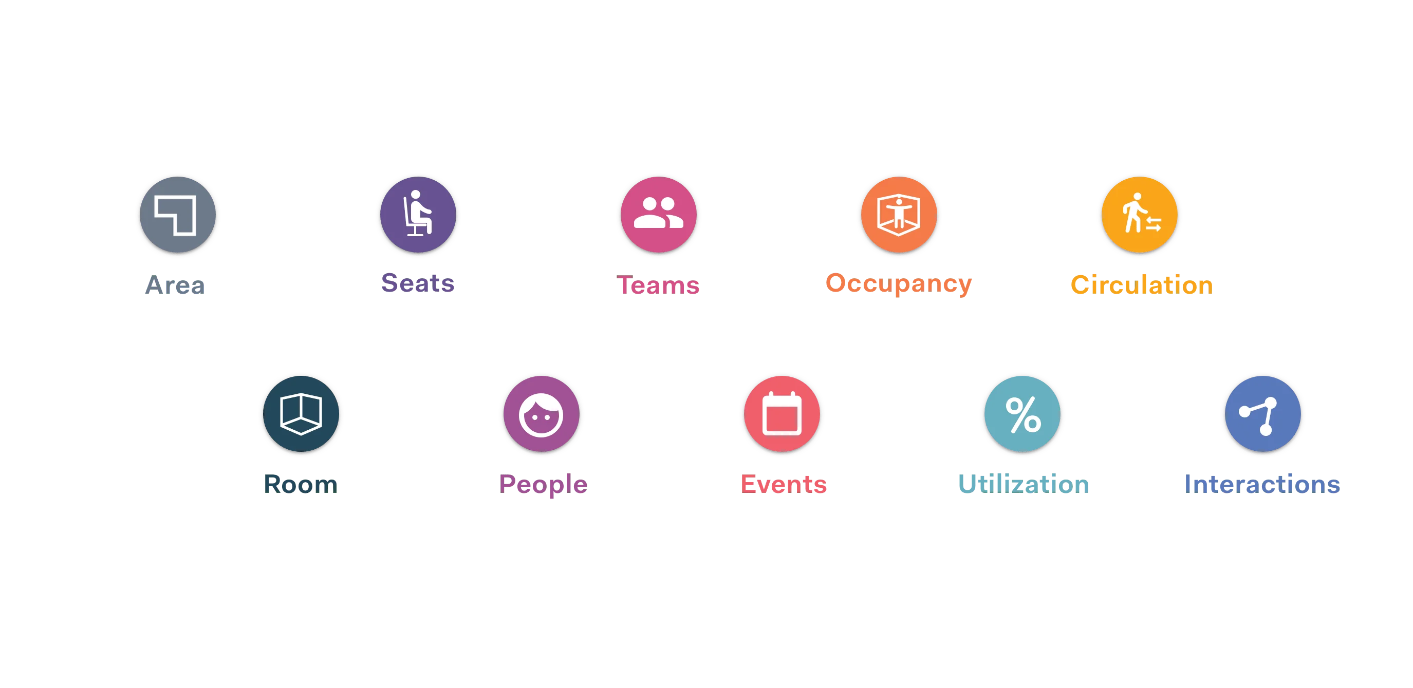
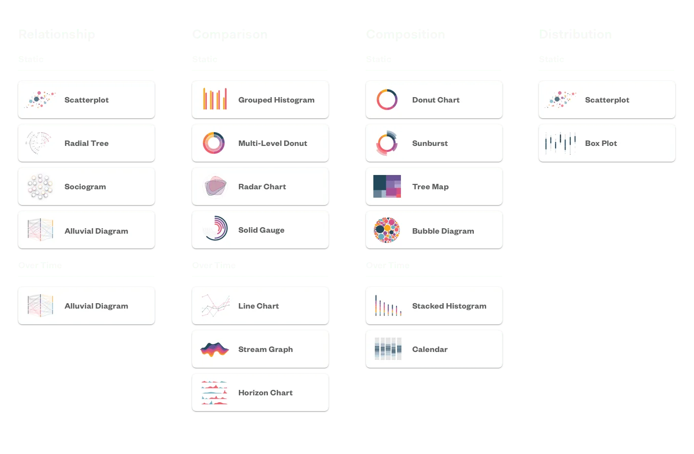
Dashboard data visualizations fell into three main categories: tabular representation, infographics, and spatial visualizations. These were designed and developed concurrently in order to establish a system for them to connect and represent the same data.
The infographics developed were to accommodate for the various data types we would be inputting into the system as well as the manner in which the user would want to pair the data with each other. We designed and developed a total of 18 visualization types using the d3.js library.
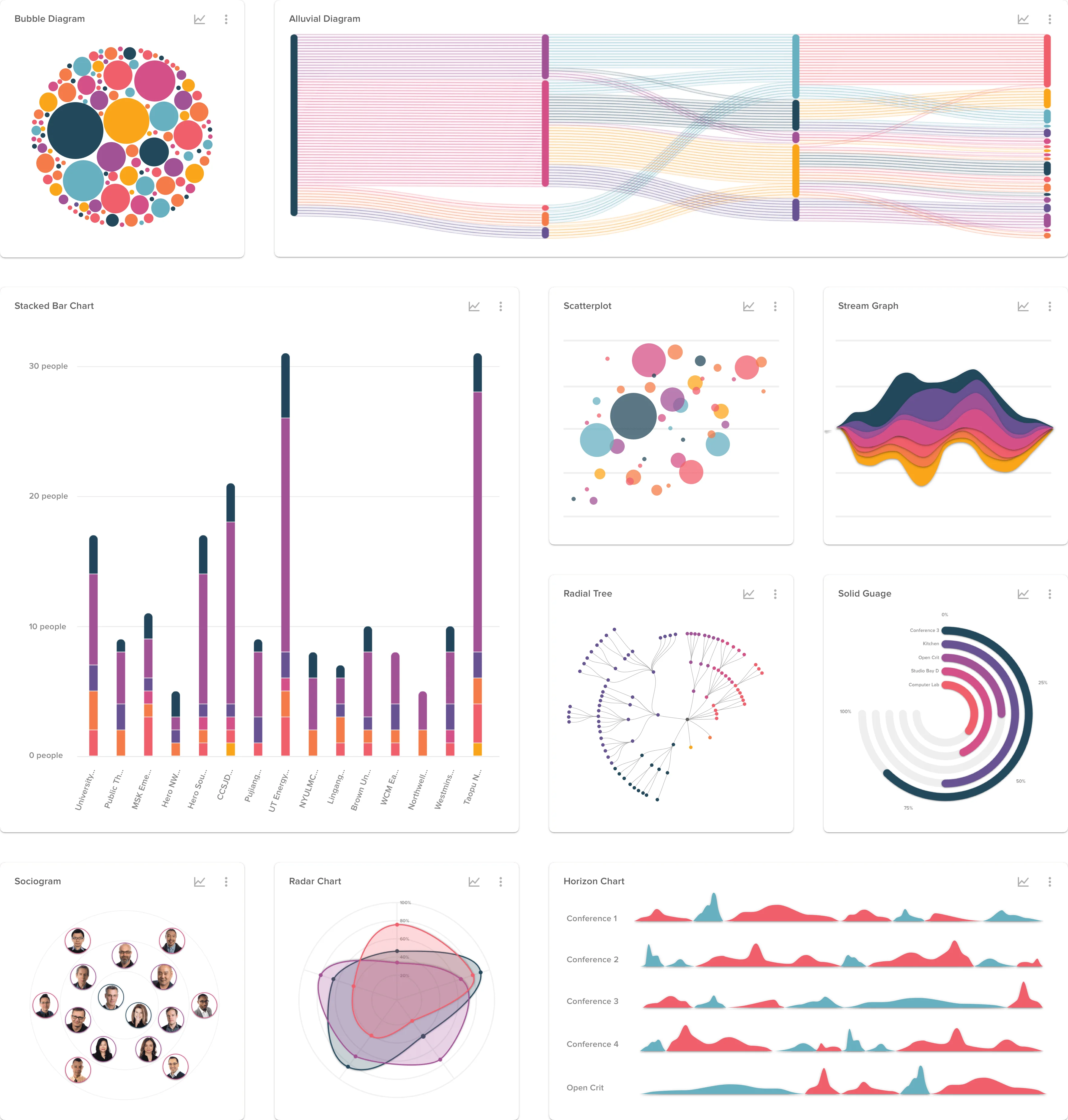
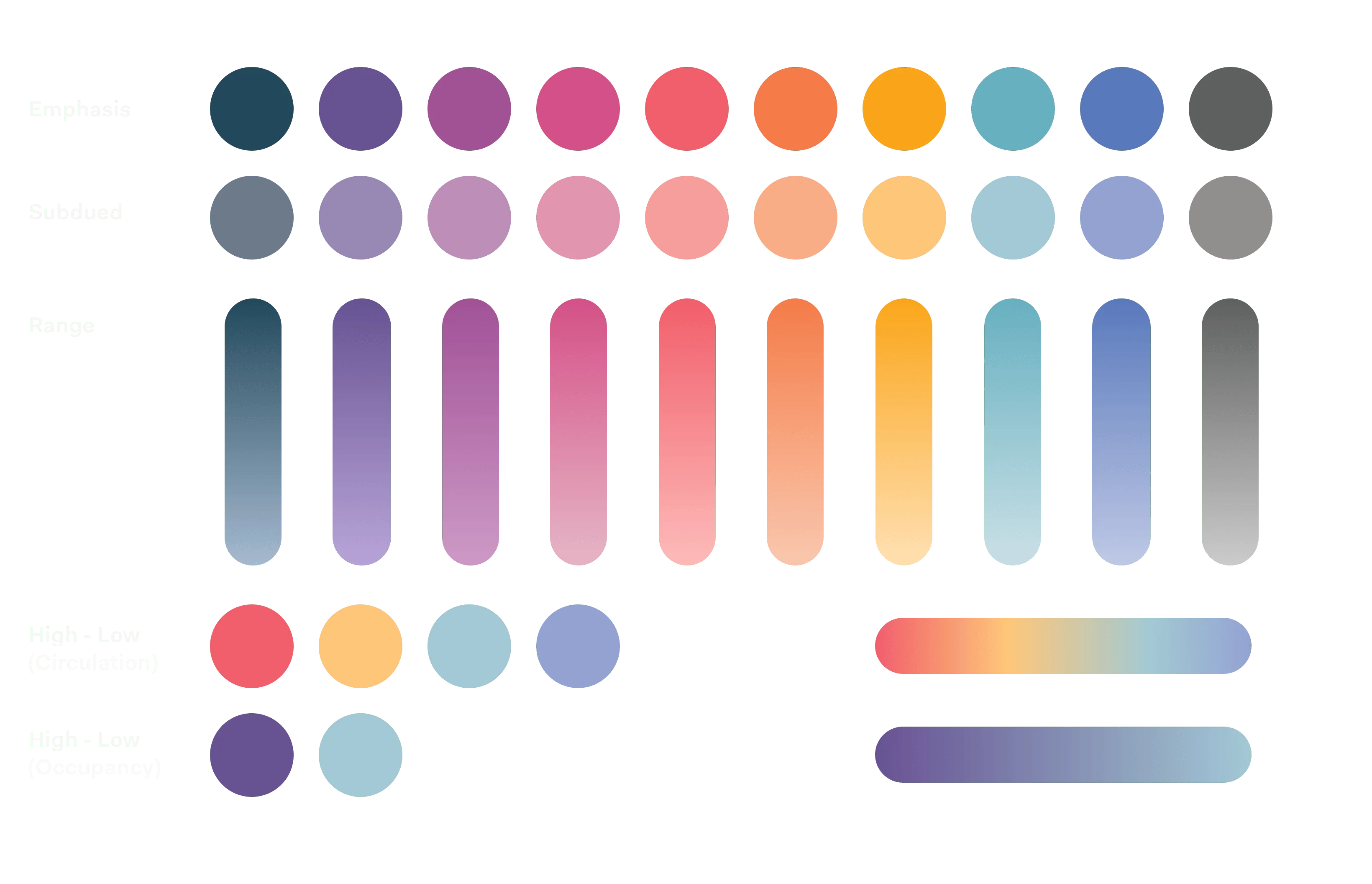
A color system consisting of 10 base colors was implemented in order to distinguish between different elements for each visualization while also conveying the identity of the platform.
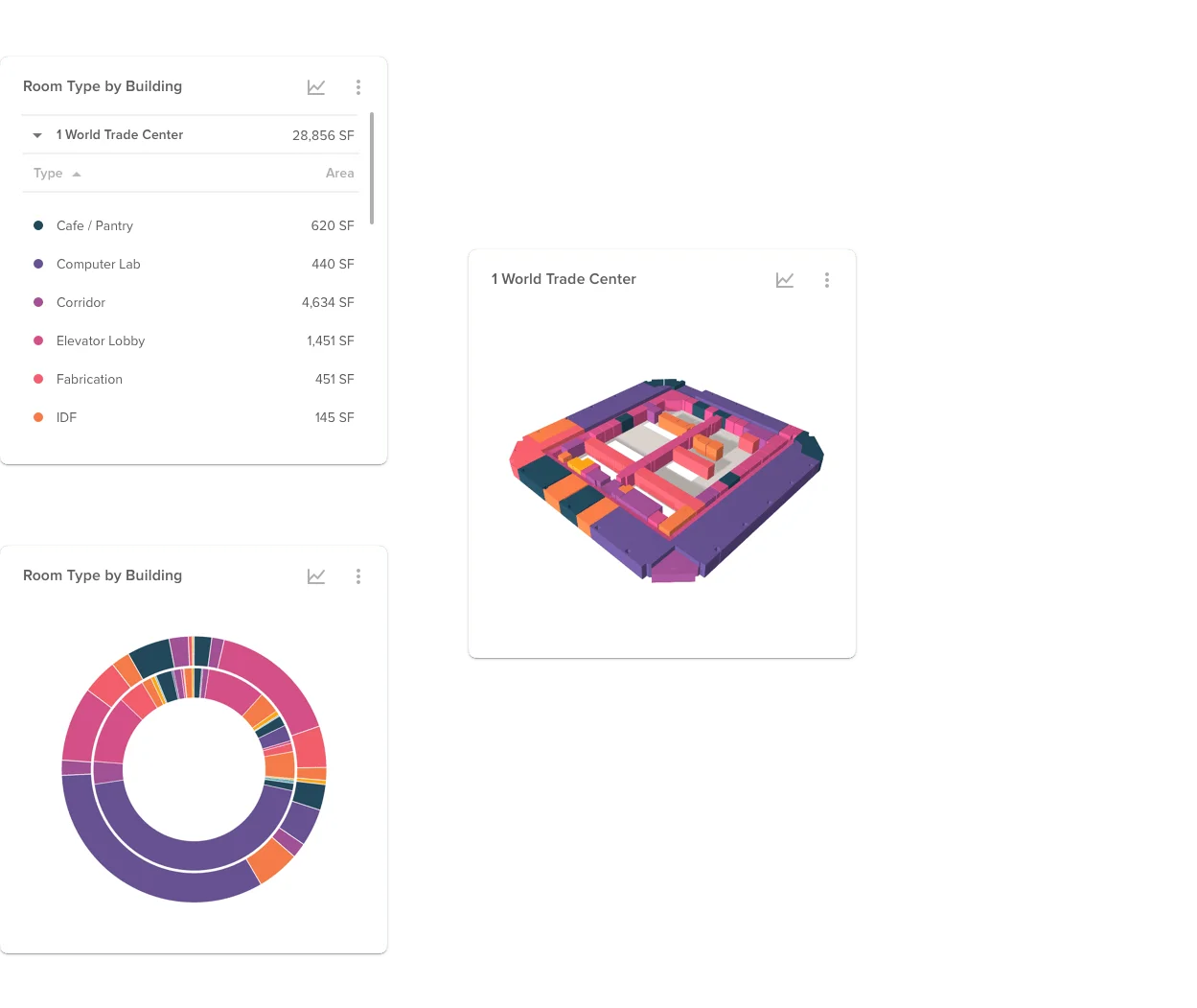
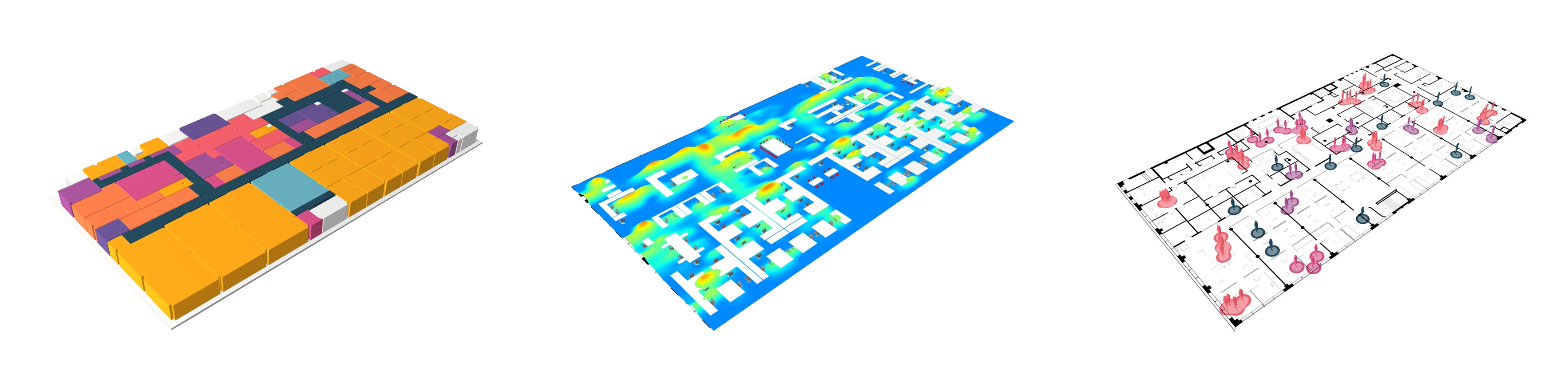
Modelo, our development partner, already had a robust framework to connect and visualize BIM files in the browser. We worked closely with them in order to further stylize these models and develop new utilization-based visualizations such as circulation and interaction types.
The final step for the proof of concept was to establish a method for data querying and pairing them with best-fit visualizations.
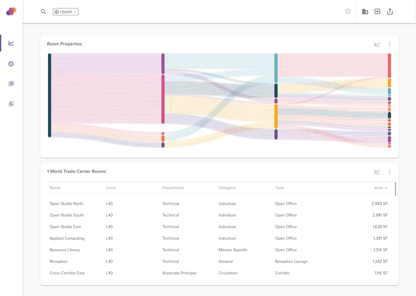
All Room Data
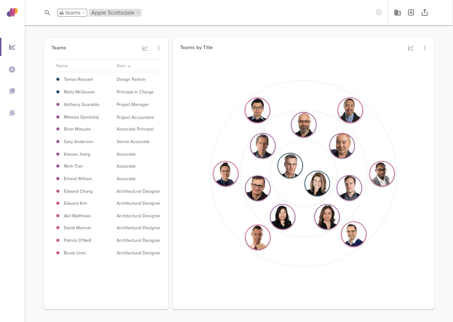
Team Composition
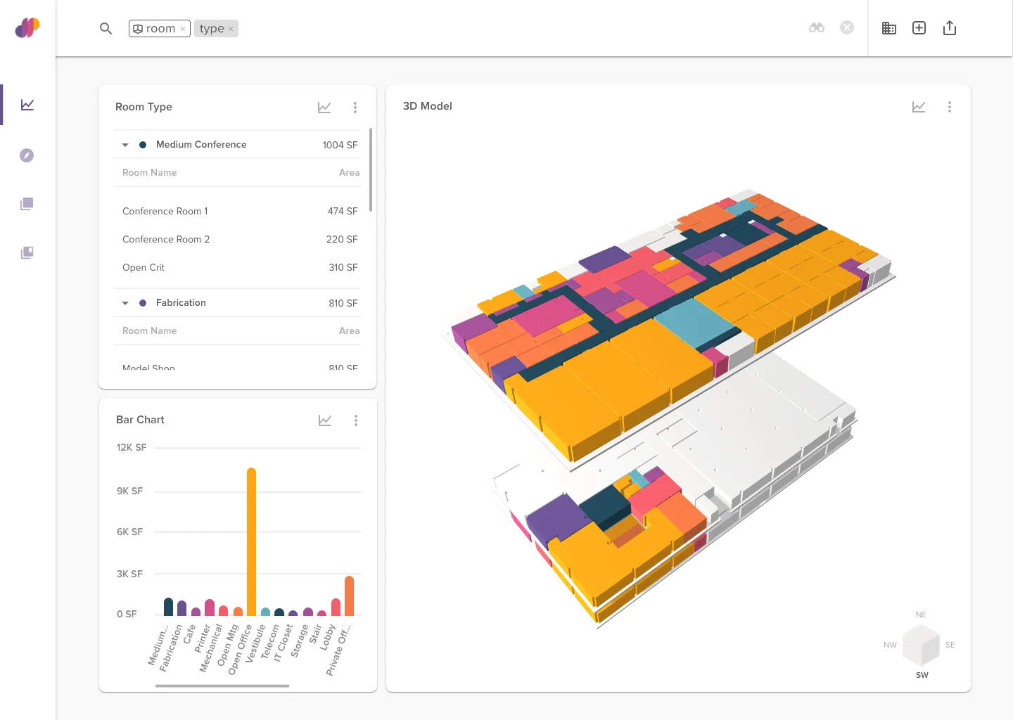
Rooms by Type
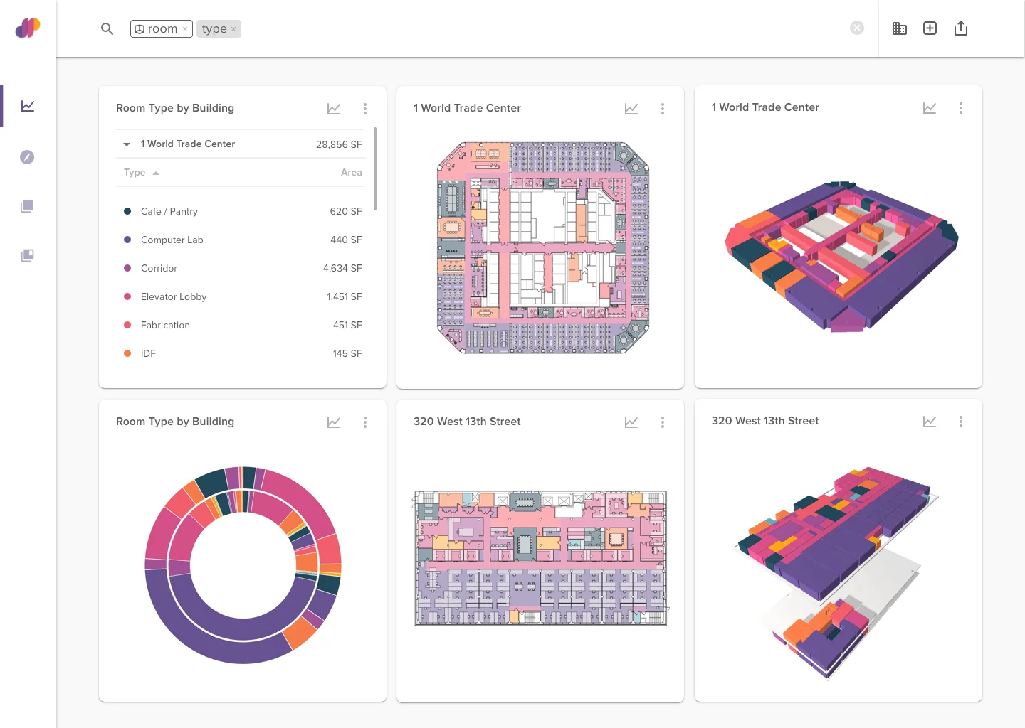
Comparison by Room Type
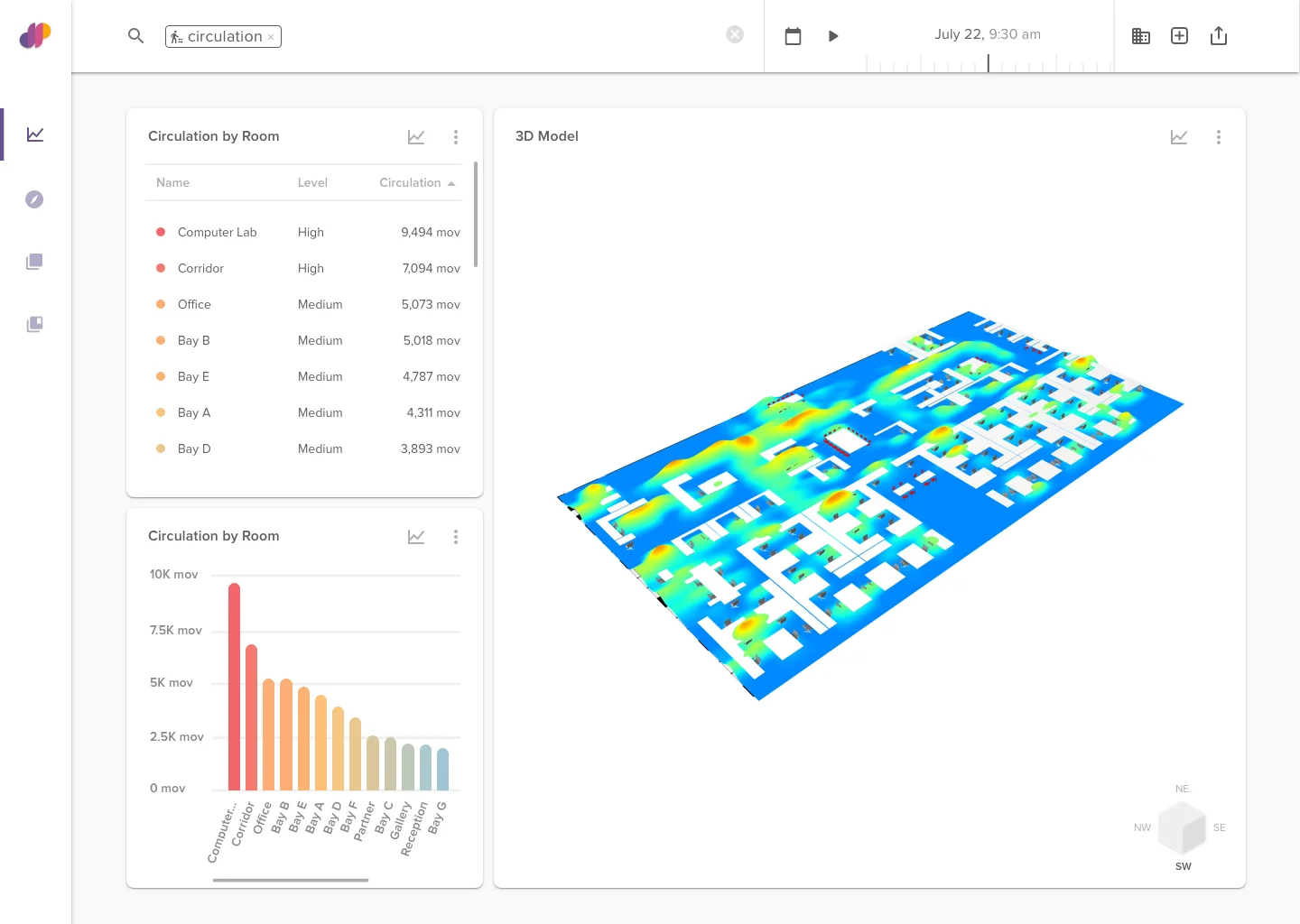
Circulation
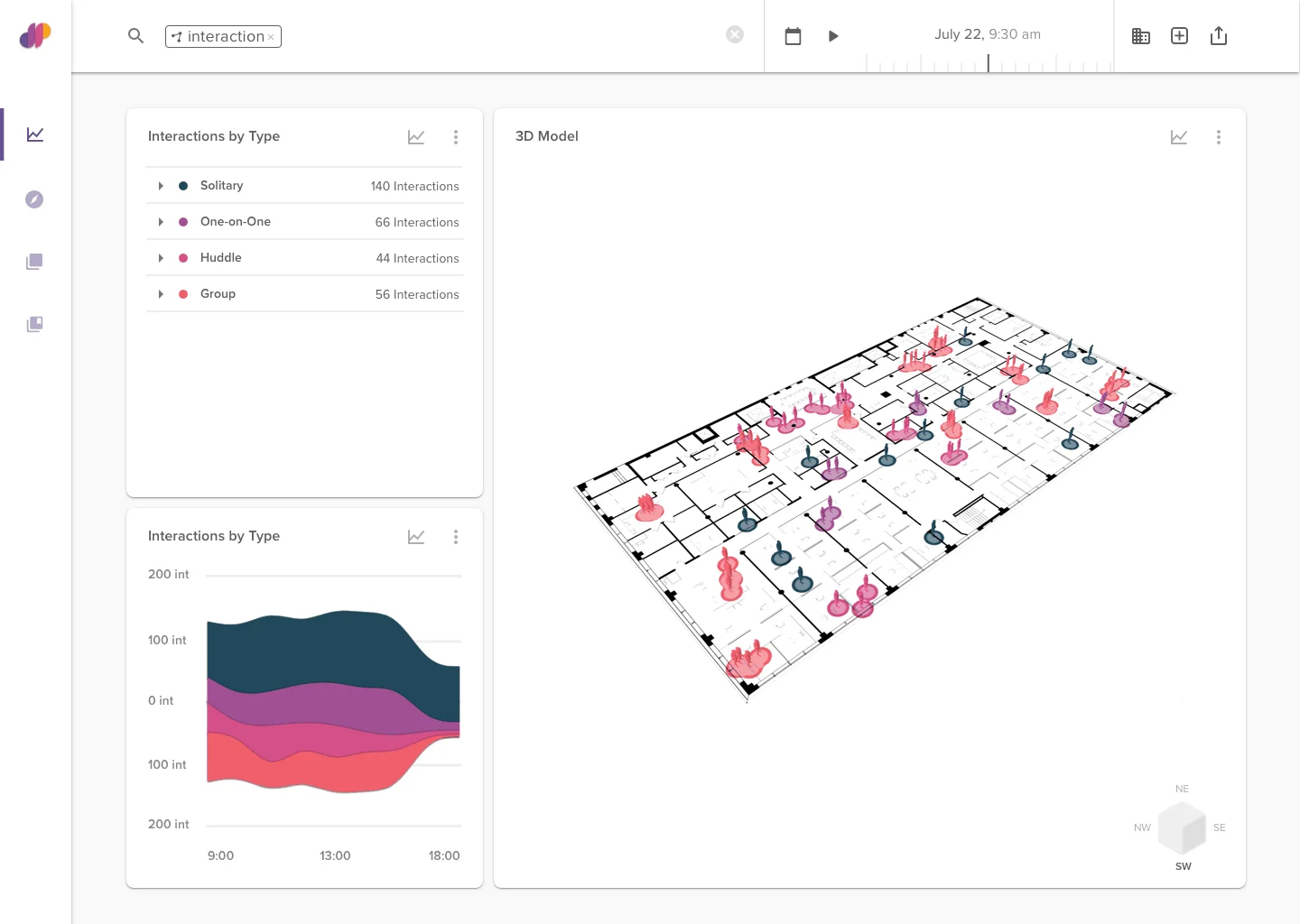
Interaction Types
For the next phase of development, we’re working on creating a scenario testing tool within the platform that would return program mixes given current building utilization metrics as well as user-defined parameters such as NSF and circulation factor.