Datadog

Notebooks

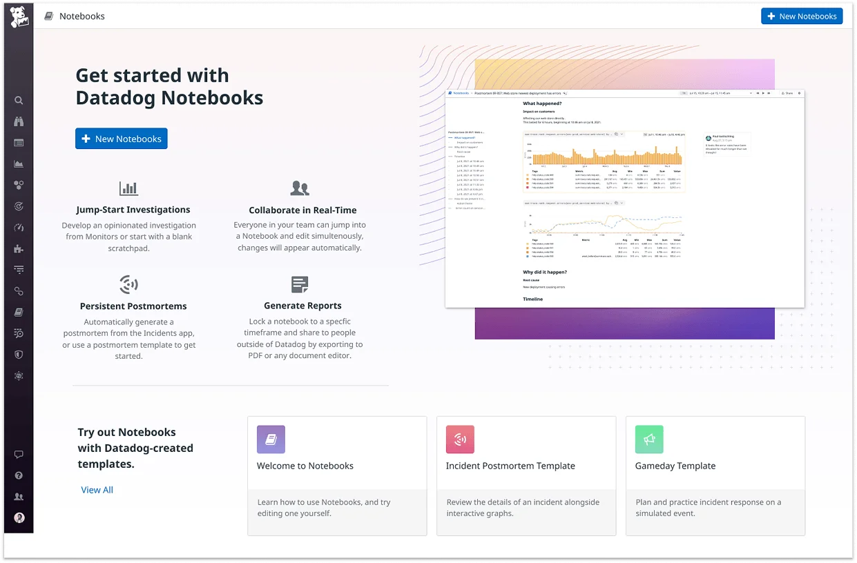
During my time in the Notebooks team, we reimagined the product with a more modern, collaborative UI. We introduced core features that made it the go-to tool for live documentation, incident analysis, and postmortems for hundreds of organizations. I also designed and implemented components adopted across the whole platform.

Problem

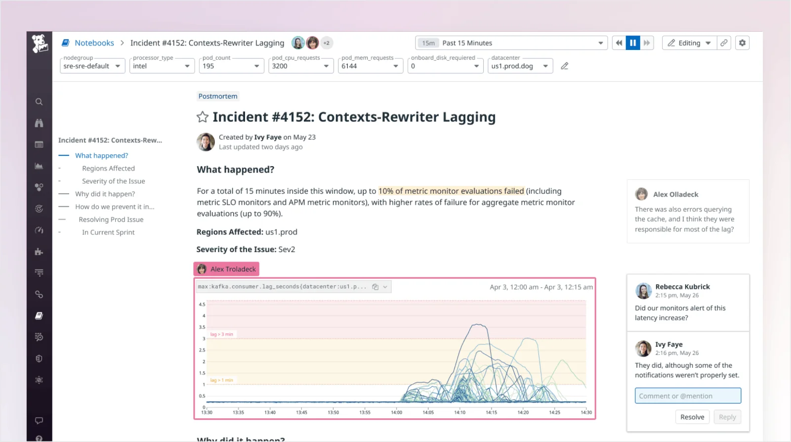
Engineering teams often rely on screenshots, Slack threads, and scattered documents to investigate incidents and share findings. These workflows make it hard to combine live data with human context, and nearly impossible to reconstruct decisions after the fact. Even within monitoring platforms, there's often no clear place to collaborate, document investigations, or hand off work across teams. As a result, valuable insights get lost, and incident timelines stretch longer than they should.

Onboarding

We fully redesigned and modernized Notebooks, starting with the landing experience. For teams new to the product, we focused on making the entry point feel clear, approachable, and useful from day one. Rather than drop users into a blank page, we introduced a landing view with templates for common use cases like postmortems, gamedays, and exploratory investigations. The layout emphasized actionability and clarity, using a fresh, colorful design that later informed onboarding patterns across the platform.

Organizing Notebooks

Organizations could have thousands of Notebooks, making it difficult to find the right one quickly, especially for new users. The original list page was overwhelming at large scale, and titles alone often weren’t descriptive enough to convey a Notebook’s purpose. We redesigned the page to support both power users and newcomers by introducing Notebook “types,” a preview option, starring, and flexible filtering by owner, type, and recency. We also added a “Suggested” section to surface high-signal content and a template gallery to help users get started with common workflows.

Building for Collaboration

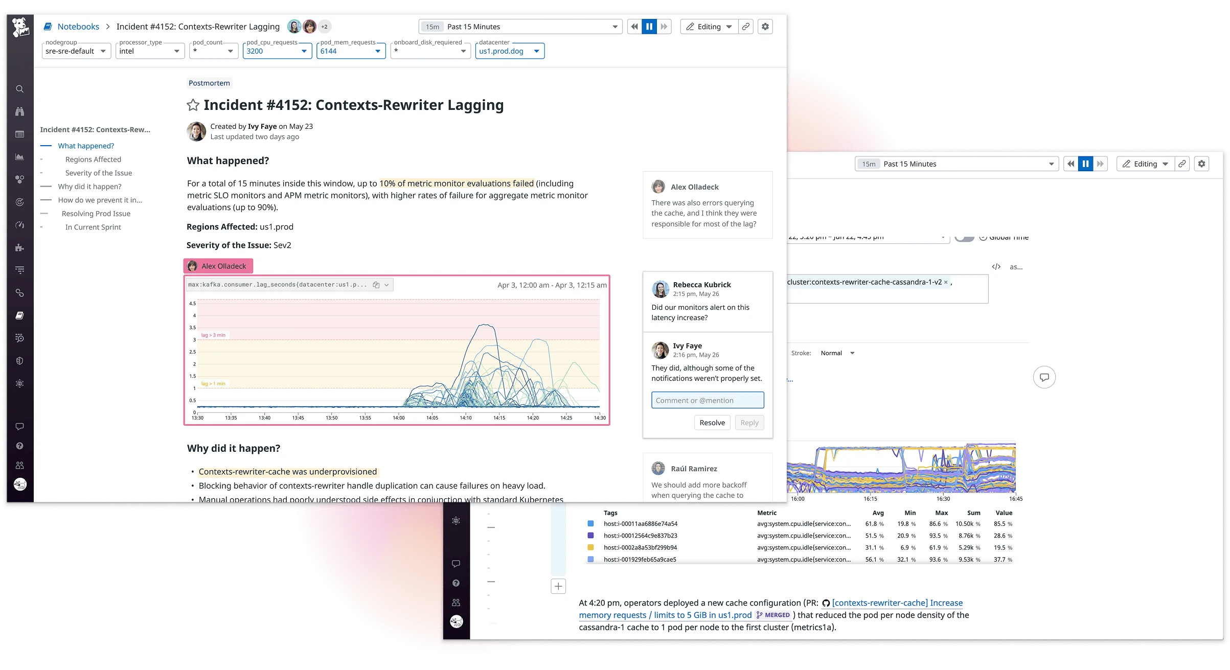
To support live investigations and postmortems, Notebooks needed to move beyond static editing. We introduced real-time multiplayer and commenting to keep teams aligned in one place. A cleaner interface, plus features like snapshotting, drag-and-drop cells, and time controls, made it easier to write, analyze, and collaborate without leaving the tool.

Markdown Editor

With text editing at the core of Notebooks, we focused on modernizing the Markdown editor used throughout the app. The previous editor was minimal, so we focused on improving formatting behaviors and interaction patterns to make writing feel smoother and more intuitive. We also added edit/preview modes and inline autocompletion to reduce friction for users less familiar with Markdown.

Template Variables

Template variables are used throughout the most active parts of the app, including Notebooks and Dashboards, to filter data and create saved views. As usage grew, we introduced several quality-of-life improvements—clearer controls for selecting and isolating options, easier ways to reset filters, and a visual redesign to make active selections more obvious. These updates helped reduce errors and made the component easier to use at scale.

Impact

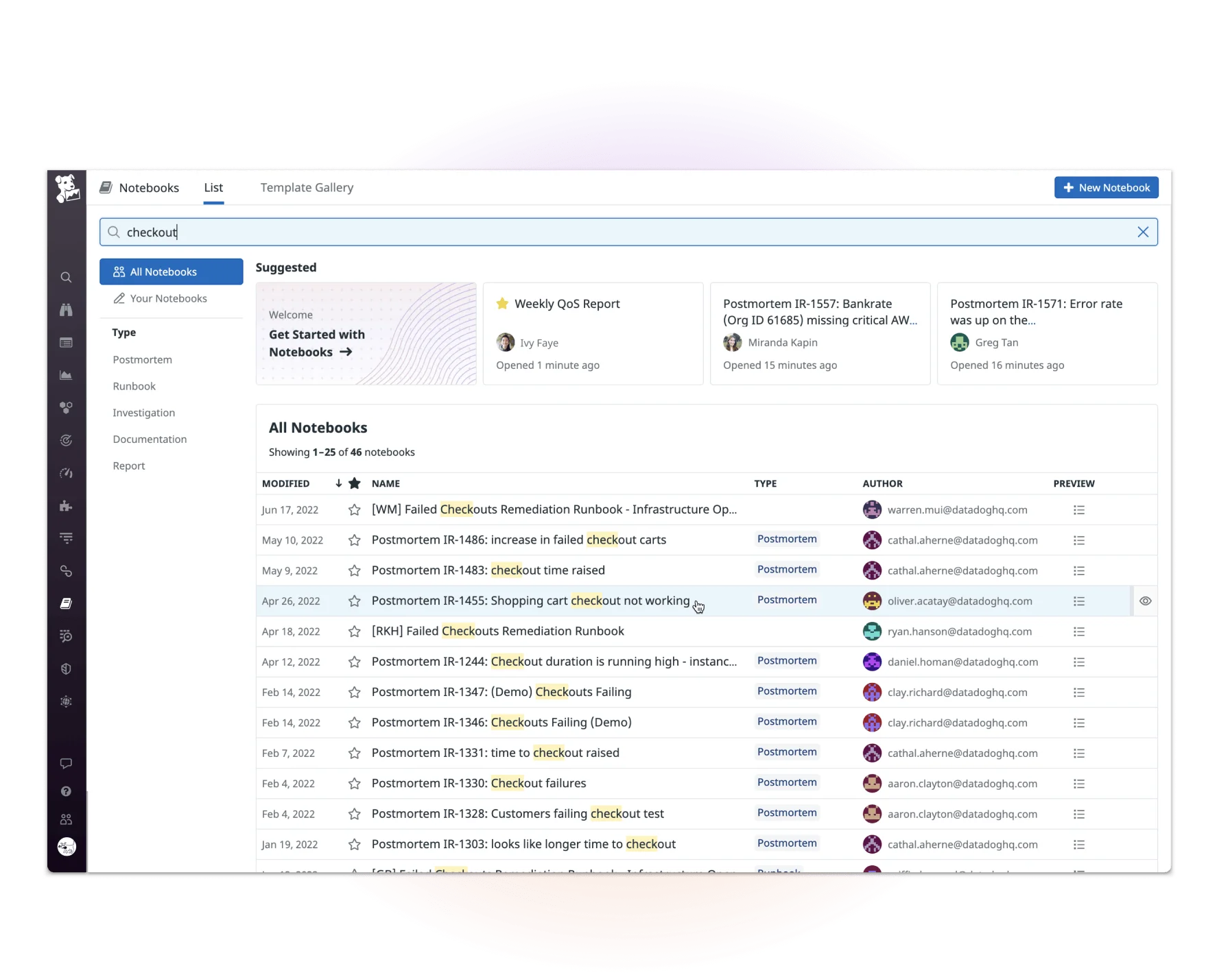
The redesign of Notebooks turned it into a core workflow tool across incident response, infrastructure analysis, and collaborative postmortems. During the span of these improvements, the number of daily organizations using the tool more than doubled. In larger orgs, features like real-time editing, searchability, and structured documentation made the tool far more usable at scale. Several design patterns introduced through this work were later adopted across the platform, contributing to a more consistent and modernized product experience.